Portfolio
Few projects
- Vegasvlc.club
- Print Prive
- Buenos Vinos
- Grava BAU
- Demo Quest games
- Spain Cannabis Guide
- Mbg BY
- Advantage limo
- Andmetics
- Darrom
- Blackt
- Luxuryvanbusny
- Peter Geld
- Etrans software
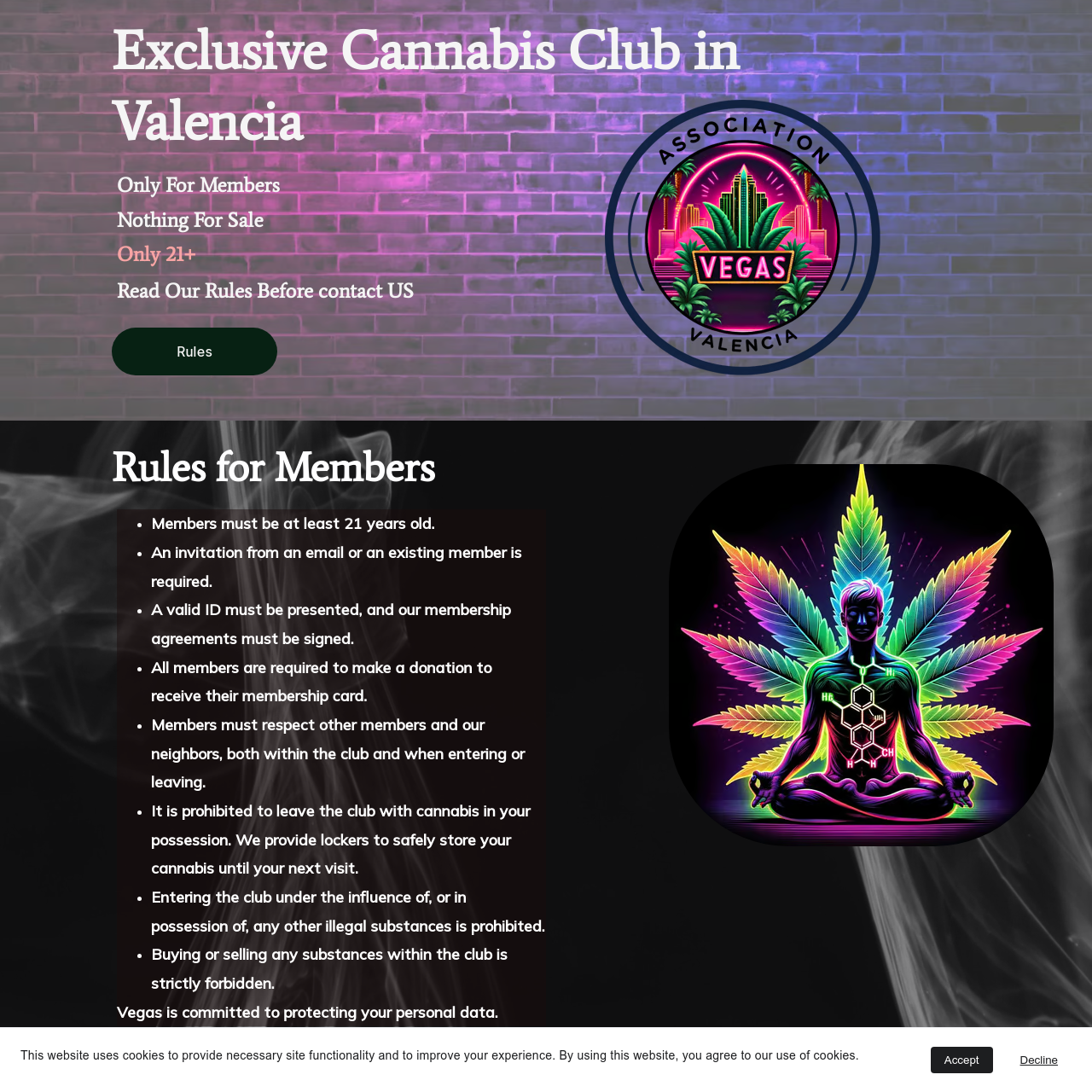
Client: ASOCIACIÓN CANNÁBICA VEGAS
Project Overview:
The goal of this project was to create an automated, multilingual membership application system for ASOCIACIÓN CANNÁBICA VEGAS. The system needed to streamline the application process, ensure compliance with data protection regulations, and enhance the user experience.
Key Features:
- The form is available in four languages: Spanish, English, French, and Italian. Users can easily switch languages using a simple interface, ensuring accessibility for a diverse audience.
- The form includes client-side validation to ensure all mandatory fields are completed. The validation messages are displayed in the selected language, guiding users through the application process seamlessly.
- Upon submission, the form data is processed using PHP and TCPDF to generate a PDF document that mirrors the official membership application form. This PDF is crucial for record-keeping and legal compliance.
- The generated PDF is automatically attached to an email and sent to the association’s email address. This automation reduces administrative overhead and speeds up the membership processing time.
- The system is designed in compliance with the Ley Orgánica 3/2018, de 5 de diciembre, de Protección de Datos Personales y garantía de los derechos digitales. All collected data is securely handled and stored, ensuring members’ privacy and data security.
- The form’s interface is designed to be intuitive and user-friendly, with clear instructions and a clean layout. This ensures a smooth experience for users of all technical levels.
Technical Stack:
- Front-end: HTML, CSS, JavaScript
- Back-end: PHP
- PDF Generation: TCPDF
- Email Handling: PHP Mail Function
Challenges and Solutions:
- Challenge: Ensuring the form and validation messages were accurately translated and dynamically switched based on user selection.
- Solution: Utilized JavaScript to dynamically change the form labels and validation messages according to the selected language.
- Challenge: Accurately replicating the official application form’s layout in the generated PDF.
- Solution: Leveraged TCPDF’s robust library to create a precise and professional PDF document that meets the association’s requirements.
- Challenge: Ensuring the secure handling and transmission of sensitive personal data.
- Solution: Implemented secure data handling practices and ensured compliance with relevant data protection laws.
Outcome:
The automated membership application system significantly improved the efficiency of ASOCIACIÓN CANNÁBICA VEGAS’s application process. It reduced manual workload, enhanced user experience, and ensured compliance with legal standards. The project was delivered on time and met all client expectations.
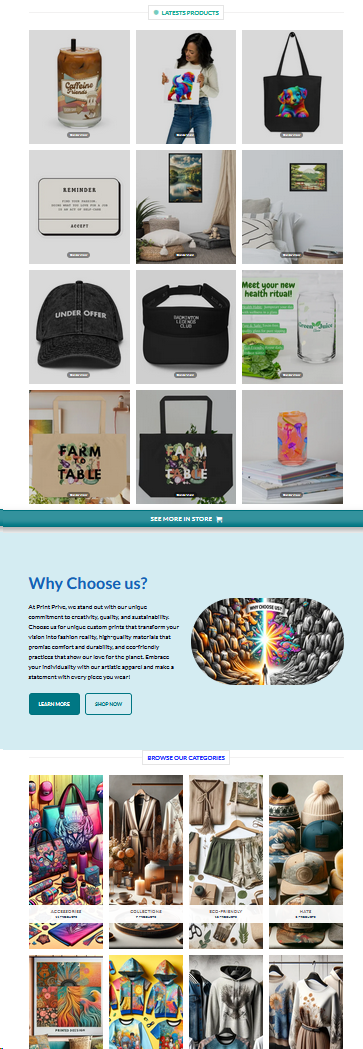
Print Prime Project
For the “Print Prime” project, we developed a comprehensive e-commerce website from scratch, focusing on custom apparel and unique printed products. The primary objective was to create a robust, user-friendly platform that integrates seamlessly with various third-party services and drives organic traffic.
Project Scope and Deliverables:
1. Complete Website Development:
- Built the website from the ground up using WooCommerce for e-commerce functionalities. Designed an engaging and visually appealing interface to attract and retain customers.
2. Payment Gateway Integration:
- Integrated secure payment gateways, including PayPal and Stripe, to provide customers with multiple payment options and ensure smooth transactions.
3. Organic Traffic Boost:
- Implemented extensive SEO strategies to drive organic traffic to the website. This included keyword optimization, content creation, meta tags, and backlinks to improve search engine rankings.
4. Chat Bot Integration:
- Developed and integrated a chat bot to assist customers with inquiries and provide immediate support. This enhanced the user experience by offering real-time assistance and improving customer satisfaction.
5. Website Security:
- Enhanced website security using Cloudflare to protect against DDoS attacks and ensure a safe browsing experience for users. Implemented SSL certificates and regular security updates to maintain data integrity.
6. API and Social Media Integration:
- Connected the website with various APIs to automate processes and improve functionality. Integrated social media platforms to enable easy sharing and promote products across different channels.
7. Product Showcase:
- Created sections to display the latest products, highlight featured items, and categorize products for easy navigation. Each product page includes high-quality images, detailed descriptions, and pricing information.
8. Why Choose Us Section:
- Developed a section to communicate the unique selling points of Print Prime, such as commitment to creativity, quality, and eco-friendly practices. This helps to build trust and differentiate the brand from competitors.
Results: The final website is a dynamic and user-friendly e-commerce platform that effectively showcases Print Prime’s diverse product range. The integration of payment gateways, chat bot, and security measures ensures a seamless and secure shopping experience. The comprehensive SEO efforts and social media integration have significantly increased organic traffic and enhanced the brand’s online presence.
Buenos Vinos Project
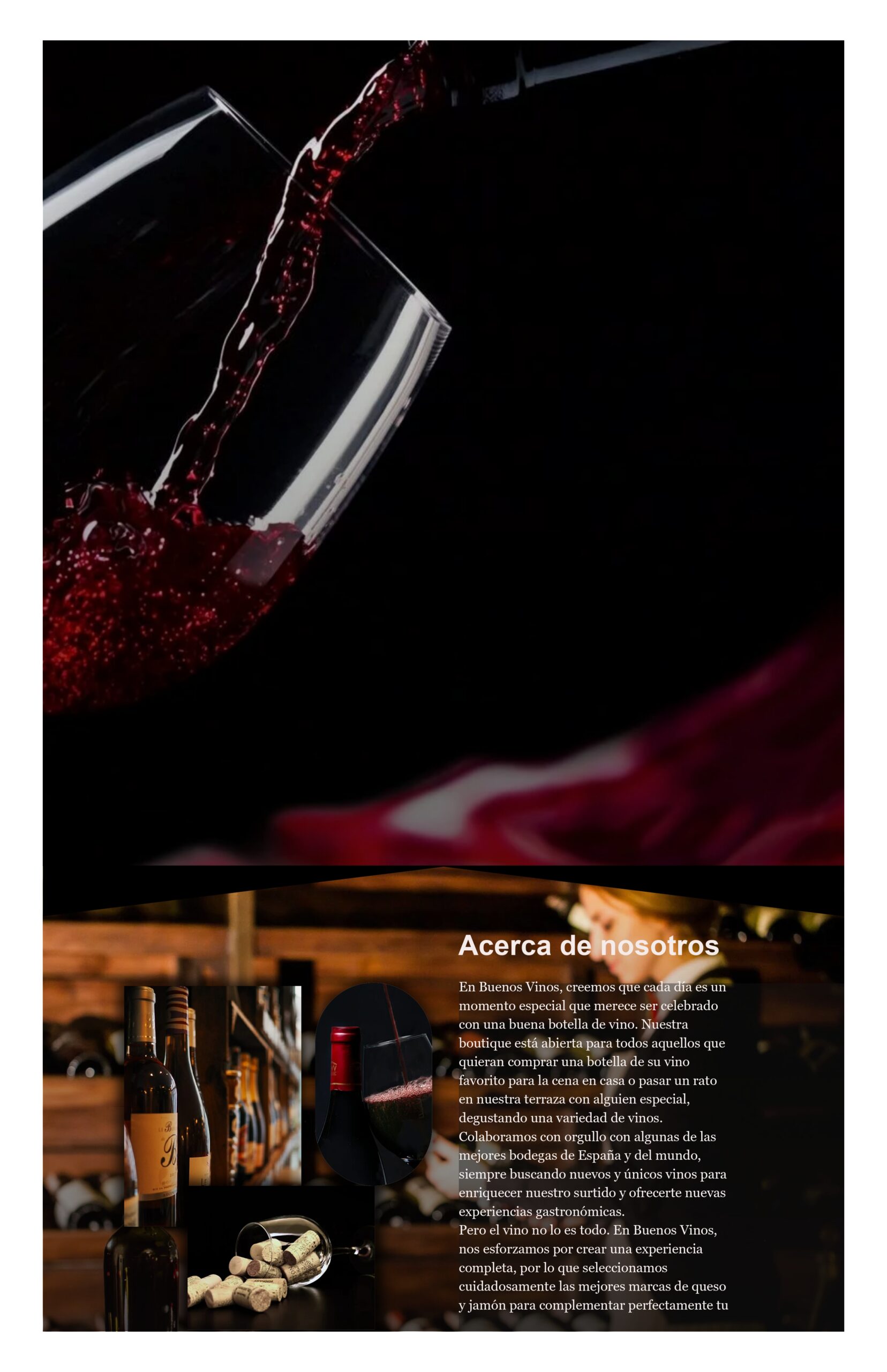
For the “Buenos Vinos” project, we developed a sophisticated multilingual website for a renowned wine boutique located in Valencia. The primary objective was to inspire visitors to explore the boutique and experience its selection of elite wines from various countries, with a special emphasis on local Valencian wines.
Project Scope and Deliverables:
1. Landing Page Development:
- Designed a captivating landing page featuring a dynamic news slider to highlight ongoing promotions and upcoming events.
2. Informative “About Us” Section:
- Crafted engaging content that details the boutique’s unique concept and rich history, aiming to connect with potential customers on a personal level.
3. Multilingual Content:
- Translated and localized the website content into Spanish to effectively reach and attract the local customer base.
4. “Wine Gallery” Showcase:
- Developed an extensive “Wine Gallery” section that beautifully displays the boutique’s diverse wine selection, complete with detailed descriptions and high-quality images.
5. Customer Testimonials:
- Included a “Testimonials” section featuring genuine customer reviews to build credibility and trust with new visitors.
6. Comprehensive “Information” Section:
- Provided essential contact details, boutique hours, and location information to ensure ease of access for potential visitors.
7. Mobile Optimization:
- Implemented a user-friendly mobile menu fixed at the bottom of the screen for seamless navigation on mobile devices.
8. SEO Optimization:
- Prepared and integrated SEO-friendly descriptions in both Spanish and English to enhance search engine visibility and attract organic traffic.
Results: The end result is a visually appealing and highly functional website that perfectly captures the unique and inviting atmosphere of the Buenos Vinos boutique. The site effectively showcases a wide array of wines, including prestigious Spanish labels, as well as an assortment of gourmet cheese and ham brands. The responsive design and thorough SEO optimization have significantly improved the boutique’s online presence, attracting new customers and boosting brand visibility.

Grava Bau Project
For the “Grava Bau” project, we developed a comprehensive and visually engaging website for a construction company based in Germany. The primary objective was to showcase the company’s services and completed projects, thereby attracting new clients and establishing a strong online presence.
Project Scope and Deliverables:
1. Landing Page Development:
- Designed a welcoming and informative landing page featuring a call-to-action for cost calculations and service details. The page includes a news slider to highlight current promotions and events.
2. Project Gallery:
- Created a detailed “Our Works” section with a gallery showcasing various completed projects. This visual representation helps potential clients see the quality and diversity of the company’s work.
3. Multilingual Content:
- Developed the website in multiple languages (German and English) to cater to a broader audience and enhance accessibility.
4. Service Information:
- Provided clear and concise information about the company’s services, including interior and exterior decoration, through dedicated sections on the website.
5. Customer Testimonials:
- Included a section for customer reviews to build trust and credibility with new visitors.
6. Contact Information and Availability:
- Added a comprehensive “Information” section with contact details, business hours, and a simple contact form to facilitate easy communication between the company and potential clients.
7. Mobile Optimization:
- Implemented a user-friendly mobile menu fixed at the bottom of the screen, ensuring seamless navigation on mobile devices.
8. SEO Optimization:
- Prepared and integrated SEO-friendly descriptions in both German and English to enhance search engine visibility and attract organic traffic.
Results: The result is a visually appealing and highly functional website that accurately represents the professional and reliable image of Grava Bau. The website effectively showcases the company’s wide range of services and completed projects. The responsive design and thorough SEO optimization have significantly improved the company’s online presence, leading to an increase in client inquiries and overall brand visibility.
Quest Orientation Games Project
For the “Quest Orientation Games” project, we developed an engaging and interactive website for an adventure game company based in Valencia. The goal was to attract participants by highlighting the excitement and uniqueness of their team-building activities.
Project Scope and Deliverables:
1. Engaging Landing Page:
- Designed a visually appealing landing page that captures the adventurous spirit of the games. Included key information about the activities and a compelling call-to-action to encourage bookings.
2. Detailed Game Information:
- Provided comprehensive details about the game, including the number of players, average difficulty, duration, and age restrictions, ensuring potential participants have all the necessary information at a glance.
3. What Awaits You:
- Created a section explaining the game progress, including the division into teams, use of mobile phones for navigation, and the completion of tasks. Highlighted the immersive experience and the fun, competitive nature of the games.
4. Examples of Tasks:
- Showcased specific tasks such as “The assignment with the radio,” “Invisible Ink,” and “An old letter,” giving potential participants a taste of the creative and challenging activities they will encounter.
5. Why Us?:
- Added a “Why Us?” section emphasizing the company’s extensive experience with over 1,000 games since 2008 and more than 35,000 satisfied players. Highlighted the unique and customized nature of their game scenarios.
6. Customer Feedback:
- Included a “Feedbacks” section featuring testimonials from previous participants, enhancing credibility and trust with new visitors.
7. Tariffs:
- Provided a clear and concise pricing table for different game types, locations, and durations. Included information about start and end points, distance, and total engagement time to help potential customers make informed decisions.
8. Custom Route and Scenario Development:
- Offered the option to create customized routes and develop individual scenarios based on customer preferences, enhancing the personalized experience.
Results: The final website is dynamic and user-friendly, effectively communicating the thrilling experience of Quest Orientation Games. The site showcases the variety and creativity of the tasks, encouraging more bookings and participation. The responsive design and clear, engaging content have significantly increased customer interest and engagement.
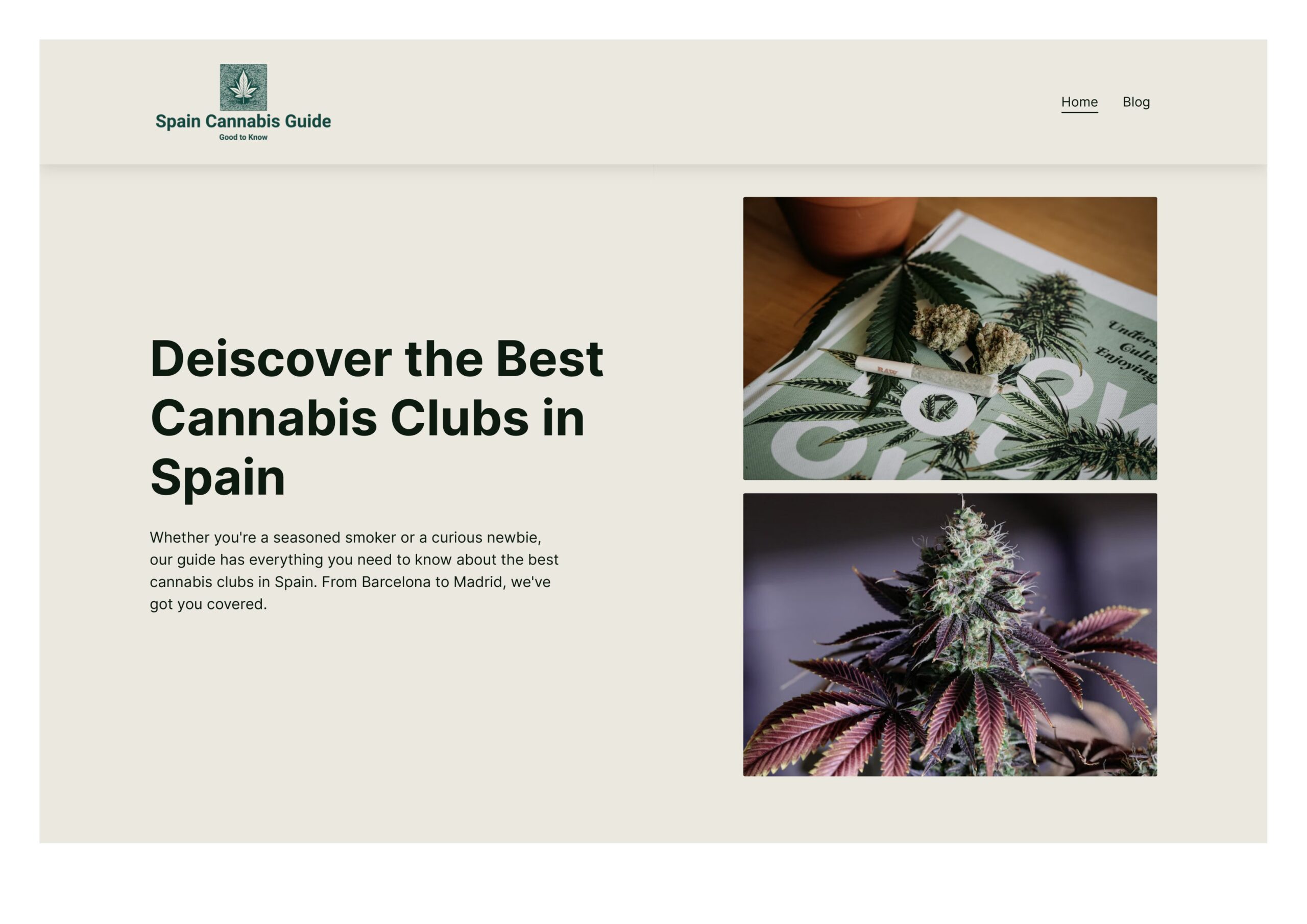
Spain Cannabis Guide Project
For the “Spain Cannabis Guide” project, we developed an informative and engaging website dedicated to guiding users to the best cannabis clubs in Spain. The goal was to attract both seasoned smokers and curious newcomers by providing comprehensive information and enhancing the website’s visibility through effective SEO strategies.
Project Scope and Deliverables:
1. Informative Landing Page:
- Designed an inviting landing page with compelling visuals and engaging content. The page effectively introduces users to the site’s purpose and provides an overview of what they can expect to find.
2. SEO Optimization:
- Implemented extensive SEO strategies to improve the website’s search engine ranking. This included keyword research, on-page SEO, meta tags, alt texts, and content optimization.
- The result was a significant increase in organic traffic, reaching 200 visitors per day within ten months.
3. Comprehensive Content:
- Developed well-researched and detailed content covering the best cannabis clubs in Spain, from Barcelona to Madrid. Each entry includes essential information such as location, membership requirements, and user reviews.
4. User Engagement:
- Added a blog section to provide regular updates and articles related to cannabis culture, events, and news in Spain. This helped in keeping the content fresh and engaging, encouraging repeat visits.
5. Visual Appeal:
- Used high-quality images and a clean, modern design to create a visually appealing website. This enhances the user experience and keeps visitors engaged.
6. Mobile Optimization:
- Ensured the website is fully responsive and optimized for mobile devices, providing a seamless experience for users on all platforms.
Results: The Spain Cannabis Guide website successfully attracted a substantial increase in organic traffic, reaching 200 visitors per week solely through SEO efforts. The engaging content and user-friendly design helped establish the site as a go-to resource for information on cannabis clubs in Spain. The improved search engine visibility and user engagement contributed significantly to the site’s success.
Школа иностранных языков “Мир без границ” Project
For the “Школа иностранных языков ‘Мир без границ'” project, we developed a comprehensive and user-friendly website for a language school located in Minsk. The primary objective was to present the school’s services, courses, and benefits in a clear and engaging manner to attract new students and enhance the school’s online presence.
Project Scope and Deliverables:
1. Engaging Landing Page:
- Designed a vibrant and welcoming landing page that immediately captures the visitor’s attention. The page features a call-to-action for enrollment and highlights the key locations of the school.
2. Detailed Service Information:
- Created a comprehensive “Центр изучения иностранных языков” section that provides detailed information about the school, its teaching methods, and the variety of languages offered.
3. Course Offerings:
- Developed a detailed section outlining the various language courses available, including English, German, Spanish, French, and more. Each course description includes the curriculum, duration, and target audience.
4. Benefits of Studying:
- Highlighted the unique advantages of studying at the school, such as experienced teachers, modern teaching methods, flexible schedules, and a supportive learning environment.
5. Visual Appeal:
- Used high-quality images and a clean, modern design to create a visually appealing website that enhances the user experience.
6. Multilingual Support:
- Provided content in multiple languages to cater to a diverse audience and make the information accessible to both local and international students.
7. SEO Optimization:
- Implemented SEO strategies to improve the website’s search engine ranking. This included keyword optimization, meta tags, alt texts, and content structuring.
8. Mobile Optimization:
- Ensured the website is fully responsive and optimized for mobile devices, providing a seamless experience for users on all platforms.
Results: The final website is informative, user-friendly, and visually appealing, effectively communicating the value and quality of education offered by the “Мир без границ” language school. The site has successfully attracted new students and improved the school’s online visibility, thanks to comprehensive SEO efforts and a well-structured presentation of services.

Advantage Limo Project
For the “Advantage Limo” project, we developed a sophisticated and user-friendly website for a premium transportation and chauffeur service based in New York City. The primary objective was to showcase the variety of services offered and provide a seamless booking experience for customers seeking luxury transportation.
Project Scope and Deliverables:
1. Engaging Landing Page:
- Designed an elegant and welcoming landing page that immediately captures the visitor’s attention. The page features a call-to-action for booking services and highlights the key benefits of choosing Advantage Limo.
2. Detailed Service Information:
- Created comprehensive service sections that provide detailed information about the various transportation options, including airport transfers, group excursions, and special event services. Each service description emphasizes the quality and luxury of the offerings.
3. Fleet Showcase:
- Developed a “Our Fleet” section that showcases the range of vehicles available, from luxury sedans to limousines and buses. High-quality images and detailed descriptions of each vehicle enhance the appeal.
4. Special Features:
- Highlighted unique services such as wheelchair accessible transportation, wedding party services, and group event transportation, ensuring potential clients understand the full range of options available.
5. Visual Appeal:
- Used high-quality images and a clean, modern design to create a visually appealing website that enhances the user experience and reflects the premium nature of the service.
6. Easy Navigation and Contact Information:
- Implemented a user-friendly navigation structure that allows visitors to quickly find the information they need. Included clear contact information and a prominent call-to-action to encourage bookings.
7. SEO Optimization:
- Implemented SEO strategies to improve the website’s search engine ranking. This included keyword optimization, meta tags, alt texts, and content structuring.
8. Mobile Optimization:
- Ensured the website is fully responsive and optimized for mobile devices, providing a seamless experience for users on all platforms.
Results: The final website is professional, informative, and user-friendly, effectively communicating the high quality and reliability of Advantage Limo’s services. The site has successfully attracted new clients and improved the company’s online visibility, thanks to comprehensive SEO efforts and a well-structured presentation of services. The easy navigation and clear call-to-actions have enhanced the overall user experience, leading to increased bookings and customer satisfaction.

Andmetics Project
For the “Andmetics” project, we developed a stylish and informative website for a brand specializing in eyebrow grooming products. The main goal was to highlight the unique features of Andmetics’ brow wax strips and attract a wider audience through engaging content and a modern design.
Project Scope and Deliverables:
1. Engaging Landing Page:
- Designed a visually striking landing page that immediately grabs the visitor’s attention. The page features a bold call-to-action encouraging visitors to explore the product range and make purchases.
2. Product Highlight:
- Created a section dedicated to showcasing Andmetics’ patented brow wax strips. This includes high-quality images, detailed product descriptions, and key benefits, such as ease of use and time efficiency.
3. Informative Content:
- Developed content that explains the advantages of using Andmetics’ products. This includes a section on the simplicity and effectiveness of achieving the perfect brow shape in just two minutes.
4. Visual Appeal:
- Used high-quality images and a clean, modern design to create a visually appealing website. The design aligns with Andmetics’ brand identity and enhances the overall user experience.
5. Call-to-Action:
- Implemented clear and compelling calls-to-action throughout the site to encourage visitors to purchase the brow wax strips and explore additional products.
6. Mobile Optimization:
- Ensured the website is fully responsive and optimized for mobile devices, providing a seamless experience for users on all platforms.
7. SEO Optimization:
- Integrated SEO strategies to improve the website’s search engine ranking. This included keyword optimization, meta tags, alt texts, and content structuring.
Results: The final website is both visually appealing and highly functional, effectively communicating the unique selling points of Andmetics’ brow wax strips. The site has successfully attracted new customers and increased brand visibility, thanks to comprehensive SEO efforts and a well-structured presentation of products. The user-friendly design and clear calls-to-action have enhanced the overall shopping experience, leading to increased sales and customer satisfaction.
Darrom Project
For the “Darrom” project, we developed a comprehensive e-commerce website for a company specializing in the sale of laptop components and accessories. The primary objective was to create an easy-to-navigate online store that showcases the wide range of products and enhances the user experience.
Project Scope and Deliverables:
1. User-Friendly Landing Page:
- Designed a clean and professional landing page that immediately informs visitors about the available product categories, brands, and models. The page includes a prominent search function to help users quickly find what they need.
2. Product Showcase:
- Developed detailed product pages for top-selling items, new arrivals, and items on sale. Each product page features high-quality images, detailed descriptions, customer ratings, and pricing information.
3. Enhanced Navigation:
- Implemented an intuitive navigation structure, including category filters and a search-by-parameter function, to make it easy for users to browse through the extensive product catalog.
4. Customer Reviews and Ratings:
- Added a section for customer reviews and ratings to build trust and provide social proof. This section includes detailed feedback from previous buyers, helping new customers make informed decisions.
5. Informative Content:
- Created informational sections such as “What is an analog, and how to avoid being deceived?” and “Darrom – a network of service centers for repair,” providing valuable insights and tips for customers.
6. Visual Appeal:
- Used high-quality images and a modern design to create a visually appealing website that reflects the professional nature of the business.
7. Mobile Optimization:
- Ensured the website is fully responsive and optimized for mobile devices, providing a seamless shopping experience for users on all platforms.
8. SEO Optimization:
- Implemented SEO strategies to improve the website’s search engine ranking. This included keyword optimization, meta tags, alt texts, and content structuring.
Results: The final website is professional, informative, and easy to navigate, effectively showcasing Darrom’s wide range of laptop components and accessories. The site has successfully attracted new customers and improved the company’s online visibility, thanks to comprehensive SEO efforts and a well-structured presentation of products. The user-friendly design and clear calls-to-action have enhanced the overall shopping experience, leading to increased sales and customer satisfaction.
BoxKit Project
For the “BoxKit” project, we developed a robust e-commerce website for a store specializing in original sports apparel, specifically from “The Money Team” (TMT). The primary objective was to create a visually compelling and user-friendly online store that highlights the exclusivity of the products and attracts sports enthusiasts.
Project Scope and Deliverables:
1. Engaging Landing Page:
- Designed an eye-catching landing page featuring high-quality images of TMT products and prominent athletes endorsing the brand. The page includes clear calls-to-action to view all products, the TMT catalog, and the Mayweather Sports catalog.
2. Product Showcase:
- Developed detailed product pages that include high-quality images, comprehensive descriptions, pricing information, and customer reviews. This allows potential customers to make informed purchasing decisions.
3. Client Testimonials:
- Added a “Our Clients” section showcasing notable athletes, such as Denis Berinchyk and Alexander Usyk, wearing TMT apparel. This serves as social proof and enhances the brand’s credibility.
4. New Arrivals:
- Created a section for new arrivals to keep the content fresh and encourage repeat visits. This section features the latest additions to the product lineup with engaging visuals and descriptions.
5. Visual Appeal:
- Utilized high-quality images and a modern design to create a visually appealing website that aligns with the brand’s identity and attracts the target audience.
6. Easy Navigation:
- Implemented a user-friendly navigation structure that allows visitors to easily browse through the product categories, view detailed product information, and make purchases.
7. Mobile Optimization:
- Ensured the website is fully responsive and optimized for mobile devices, providing a seamless shopping experience for users on all platforms.
8. SEO Optimization:
- Integrated SEO strategies to improve the website’s search engine ranking. This included keyword optimization, meta tags, alt texts, and content structuring.
Results: The final website is dynamic, visually appealing, and easy to navigate, effectively showcasing the exclusive TMT apparel and other sports merchandise. The site has successfully attracted new customers and boosted the brand’s online presence, thanks to comprehensive SEO efforts and a well-structured presentation of products. The user-friendly design and clear calls-to-action have enhanced the overall shopping experience, leading to increased sales and customer satisfaction.
Luxury Van & Bus NYC Project
For the “Luxury Van & Bus NYC” project, we developed a sleek and informative website for a premium transportation service provider in New York City. The primary objective was to showcase the diverse fleet of vehicles and offer a seamless booking experience for various transportation needs, including airport transfers, wedding parties, and business meetings.
Project Scope and Deliverables:
1. Engaging Landing Page:
- Designed an attractive landing page featuring high-quality images of the fleet against a dynamic backdrop of New York City. The page includes clear calls-to-action for online booking and highlights the main services offered.
2. Fleet Showcase:
- Developed a detailed “Our Fleet” section that displays the range of vehicles available. Each vehicle listing includes high-quality images, passenger capacity, luggage capacity, and amenities such as leather seats and flat-screen TVs.
3. Service Information:
- Created comprehensive service pages outlining the various transportation options, such as airport transfers, wedding parties, and business meetings. Each page emphasizes the luxury and convenience of the service.
4. Customer Testimonials:
- Added a section for customer reviews to build trust and provide social proof. This section includes detailed feedback from previous clients, enhancing the company’s credibility.
5. Visual Appeal:
- Used high-quality images and a modern design to create a visually appealing website that reflects the premium nature of the service.
6. Easy Navigation:
- Implemented a user-friendly navigation structure that allows visitors to easily browse through the fleet, view detailed service information, and make bookings.
7. Mobile Optimization:
- Ensured the website is fully responsive and optimized for mobile devices, providing a seamless experience for users on all platforms.
8. SEO Optimization:
- Integrated SEO strategies to improve the website’s search engine ranking. This included keyword optimization, meta tags, alt texts, and content structuring.
Results: The final website is elegant, informative, and easy to navigate, effectively showcasing the luxurious transportation services offered by Luxury Van & Bus NYC. The site has successfully attracted new clients and enhanced the company’s online presence, thanks to comprehensive SEO efforts and a well-structured presentation of the fleet and services. The user-friendly design and clear calls-to-action have improved the overall booking experience, leading to increased customer satisfaction and sales.

Peter Geld Project
For the “Peter Geld” project, we developed an elegant and informative website for a shoe repair, tailoring, and leather workshop. The primary objective was to highlight the workshop’s expertise in shoe and leather repair, custom leather goods production, and tailoring services, attracting both local and online customers.
Project Scope and Deliverables:
1. Engaging Landing Page:
- Designed a sophisticated landing page that immediately captures the visitor’s attention with high-quality images of the workshop’s craftsmanship. The page includes clear navigation to key sections such as services and contact information.
2. Service Information:
- Created comprehensive service sections detailing the various offerings, including shoe repair, bag repair, belt manufacturing, and custom tailoring. Each section emphasizes the quality and craftsmanship of the services provided.
3. Visual Appeal:
- Used high-quality images and a clean, modern design to create a visually appealing website that reflects the artisanal nature of the business. The imagery showcases the intricate work and attention to detail in leather restoration and custom tailoring.
4. Easy Navigation:
- Implemented a user-friendly navigation structure that allows visitors to easily browse through the services and find detailed information about each offering.
5. Mobile Optimization:
- Ensured the website is fully responsive and optimized for mobile devices, providing a seamless experience for users on all platforms.
6. SEO Optimization:
- Integrated SEO strategies to improve the website’s search engine ranking. This included keyword optimization, meta tags, alt texts, and content structuring.
Results: The final website is both elegant and functional, effectively showcasing the high-quality services offered by Peter Geld. The site has successfully attracted new customers and enhanced the workshop’s online presence, thanks to comprehensive SEO efforts and a well-structured presentation of services. The user-friendly design and clear calls-to-action have improved the overall user experience, leading to increased customer satisfaction and business growth.

eTrans Solutions Project
For the “eTrans Solutions” project, we developed a modern and informative website for a leading software development company. The primary objective was to showcase the company’s wide range of services and expertise, attracting new clients and reinforcing their reputation in the industry.
Project Scope and Deliverables:
1. Engaging Landing Page:
- Designed a visually appealing landing page with high-quality images and a dynamic slider. The page features a compelling call-to-action to learn more about the company and highlights their impressive client base.
2. Service Information:
- Created a comprehensive “Our Services” section detailing the core offerings:
- Application Development: Custom medical applications, client software solutions, and mobile applications.
- Development and Operations Consulting: Expert consultation for IT transformations, DevOps implementations, and tailored IT solutions.
- Business Intelligence: Analytics software for healthcare, financial analytics software, and industry-specific analytics solutions.
3. Visual Appeal:
- Utilized a clean, modern design to reflect the innovative nature of the company. High-quality images and icons were used to enhance the visual appeal and improve user engagement.
4. Easy Navigation:
- Implemented a user-friendly navigation structure, allowing visitors to easily access detailed information about the company’s services, projects, and team.
5. Innovations and Business Goals:
- Added sections highlighting the company’s commitment to innovation, business success, and goal achievement. These sections emphasize the company’s dedication to staying at the forefront of technology and delivering exceptional results for their clients.
6. Mobile Optimization:
- Ensured the website is fully responsive and optimized for mobile devices, providing a seamless experience for users on all platforms.
7. SEO Optimization:
- Integrated SEO strategies to improve the website’s search engine ranking. This included keyword optimization, meta tags, alt texts, and content structuring.
Results: The final website is modern, informative, and easy to navigate, effectively showcasing the extensive range of services and expertise offered by eTrans Solutions. The site has successfully attracted new clients and enhanced the company’s online presence, thanks to comprehensive SEO efforts and a well-structured presentation of services. The user-friendly design and clear calls-to-action have improved the overall user experience, leading to increased client inquiries and business growth.
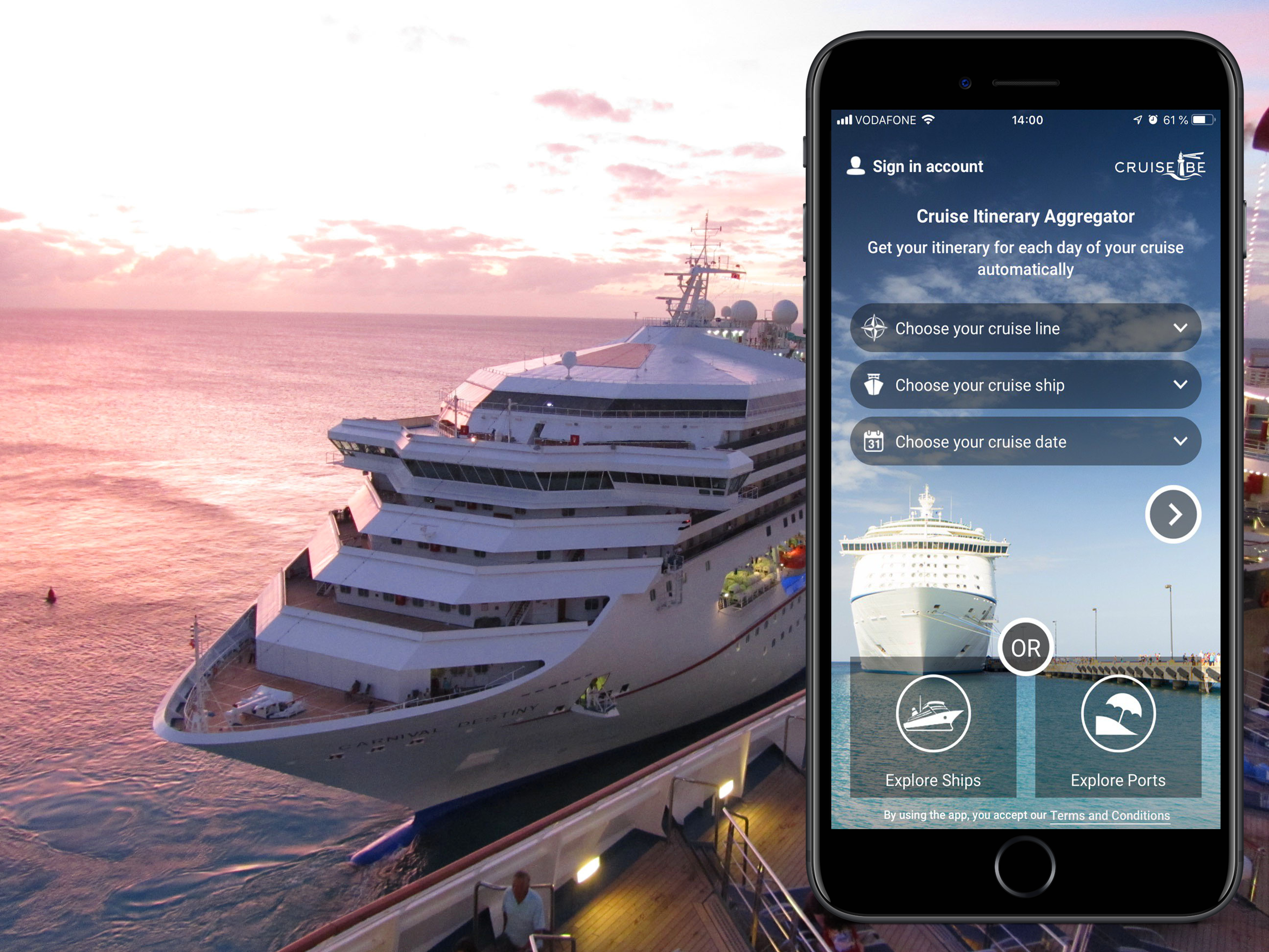
Cruise Shipmate
– >Real-time price monitoring
– >Comparison of prices and special offers
– >Countdown to dispatch
– >The possibility of ordering services
– >Price Jump Alert
– >Informative sections
– >Reviews, tips and photos
– >Store magazines
– >Cruise Ship Tracker-
– >Video surveillance
App Store Rating
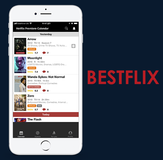
BESTFLIX
-> Premier calendars
-> Comments module
-> Personal account
-> Notification system
-> Cabinet Settings
-> Search
-> Фильтры
App Store Rating
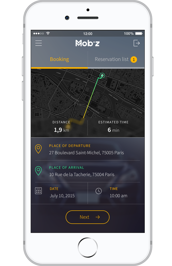
Mobiz taxi
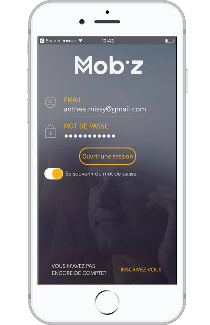
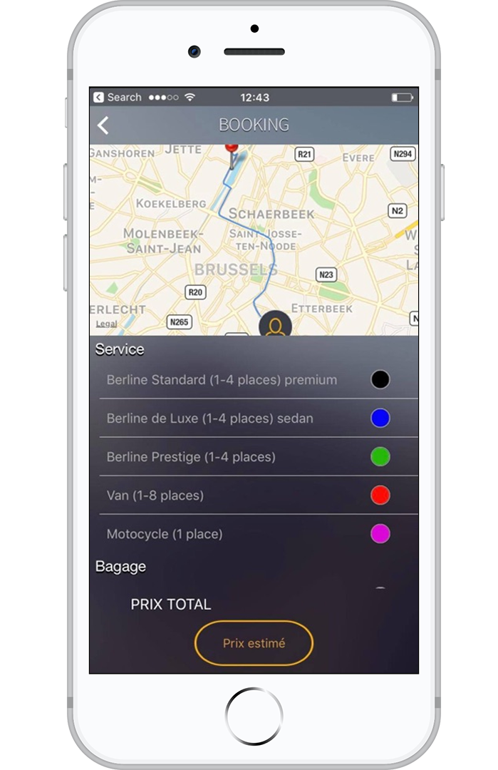
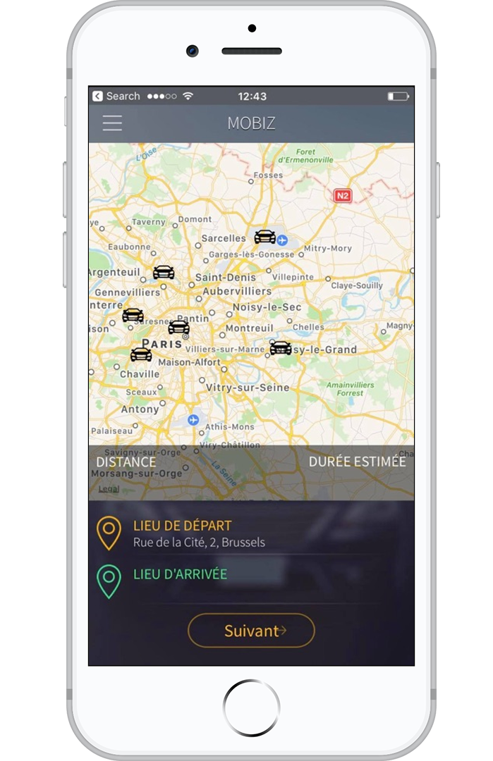
The application was developed for taxi drivers. It has the functions of global posing in real time. Personal account and interface design settings
